Urban Brokers

Brand Development
Urban Brokers, a residential real estate group, was looking to modernize its brand to be a high-end standout in the competitive DC-area market.
A new logo, marketing collateral, stationery, and style guide were provided to accomplish this goal.


Logo Development
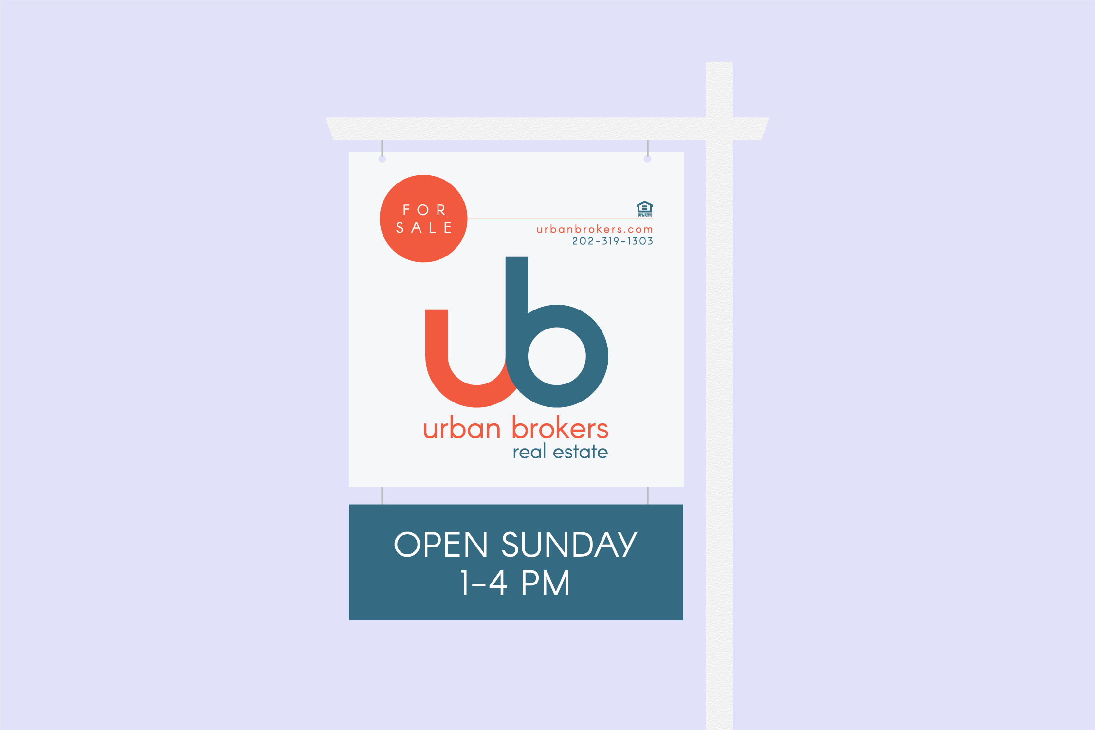
The logo is a tribute to the brokerage’s commitment to customer service. The ‘U’ and ‘B’ seamlessly flow together—representing a harmonious partnership.


Design
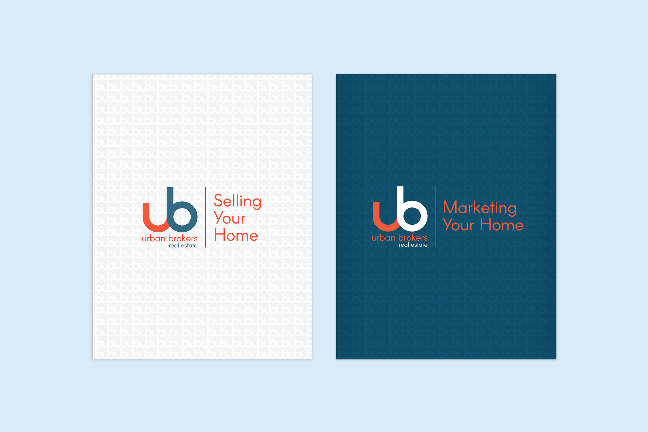
The collateral is amplified by a subtle, sophisticated texture inspired by the logo.

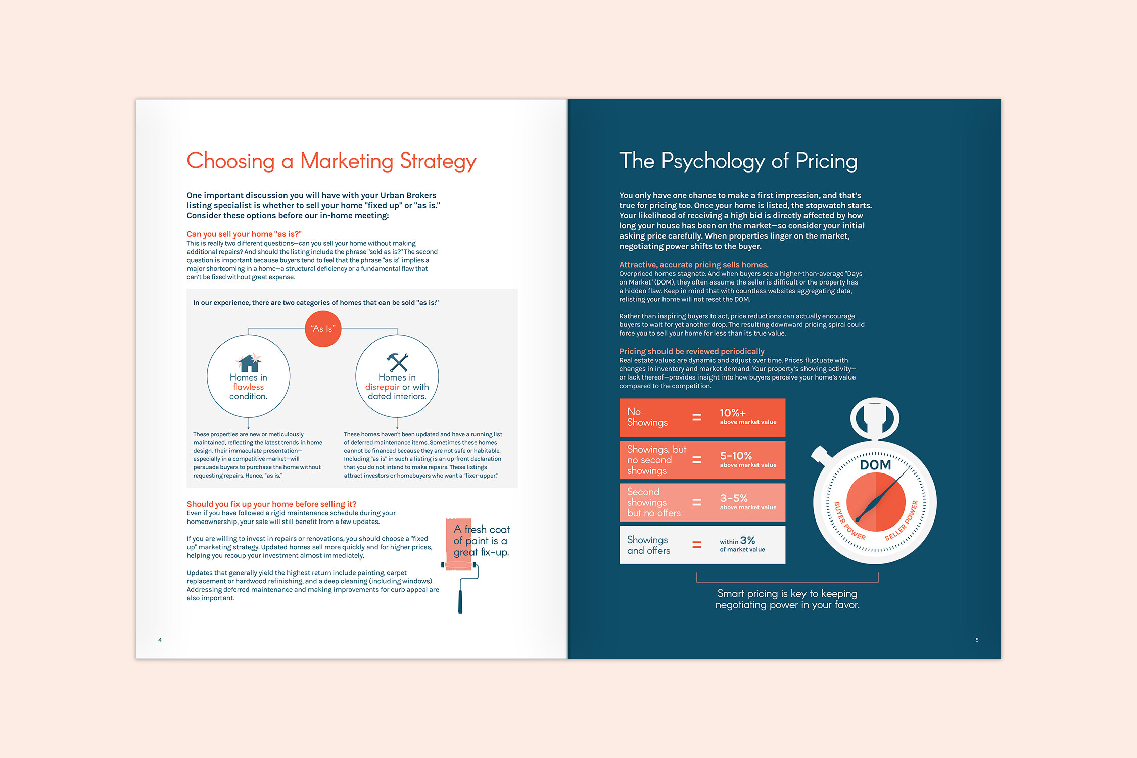
The custom graphics and decorative type provide personality—helping make the group more approachable.


